PizzaDuluth
Itala Pizza
“top pizza in an unassuming spot”
from home in the burbs (opens in a new tab)Three projects from my work on ADP Lyric, the HR platform hundreds of companies use to run their people stuff. The screens here are simplified versions I rebuilt. If you'd like to see the real ones, email me and I'll send them over.
I'm the only designer on this one. I rethought how HR teams build things like onboarding and leave, so they don't have to call us for help.
Covers about 10 client tickets · rolling out in phases
Moving someone to a new country without firing and rehiring them. Mostly an information architecture puzzle.
Testing with clients now · success means fewer manual transfer requests
When an upload has thousands of rows and a bunch of errors, you can fix them right in the app instead of starting over.
Job change is live · sales says it performs better
I build my own prototypes with Claude in VS Code, using the same components our engineers use. What I test with users is pretty close to what actually ships.
I use Figma AI to sketch out a few directions fast before I commit to one.
Then I design the flows and final screens in Figma, with accessibility notes built in from the start.
I hand Claude my Figma frames or screenshots of the product, and we build a working prototype on our actual component library.
We test with users on the coded prototype, and engineers get something that already speaks their language.
I took over the UX for a whole module of their policy platform pretty soon after joining, and my usability and accessibility audit ended up shaping the roadmap.
I designed an internal database tool for a consumer goods client, taking it from wireframes all the way to developer-ready prototypes.
A tiny startup where I was the only designer. People could save things they wanted to buy and ask friends what they thought. We got it into early users' hands.
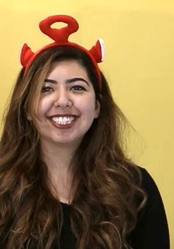
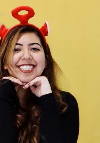
I'm a senior UX designer at ADP, where I work on Lyric, our HR platform. I'm the only designer on enhanced workflows, and I also design web and mobile flows across core HR. That means designing for a lot of different people at once: HR teams, managers, employees, admins, and contractors. I also wrote accessibility annotation guidelines my team uses for commonly used patterns.
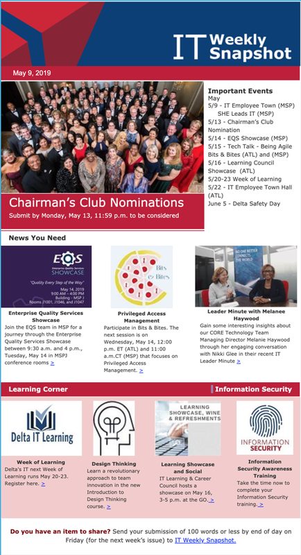
I started in graphic design, making posters and event branding for Georgia Tech and HackGT, and internal newsletters as an IT intern at Delta. Then I moved into product. I was the only designer at a small startup, designed internal tools as a consultant at Capgemini, and owned a module at OneTrust before joining ADP in 2022, where I was promoted to senior a year later. The common thread is taking something complicated and making it feel simple for everyone who has to use it.
I studied Computational Media at Georgia Tech, so I'm happy going from a Figma frame to working code.
When I'm not designing software I'm usually drawing faces in charcoal, painting, making a poster for something, or trying a new restaurant. Here's the art, the graphic design, and where I've been eating.
I'm a huge foodie. I keep track of everywhere I eat on Corner, and before that I wrote 412 reviews on Yelp. Here are a few spots I keep going back to.
In my own words, straight from my Corner notes.
PizzaDuluth
“top pizza in an unassuming spot”
from home in the burbs (opens in a new tab)CoffeeDecatur
“BEST BEANS 10/10 took a latte art class here too”
from coffee around atl (opens in a new tab)Turkish kabobsVirginia-Highland
“forever an Adana kabob”
from my middle eastern peoples (opens in a new tab)DinnerMidtown
“if Turkish şili levrek is on the menu, it is a must have”
from nice places to go (opens in a new tab)All twelve live on Corner.
See all 487 on Corner (opens in a new tab)412 Yelp reviews (needs a login) (opens in a new tab)
I log every concert I go to, back to my first one in 2008. Scroll the wheel to pick a year, then a show, then an artist.
drag around the wheel or use ↑ ↓ · enter to pick · esc to go back
admit one
by genresets seen
Charcoal, pencil, ink, paint, and watercolor. A lot of faces, plus whatever ends up on my table that day.
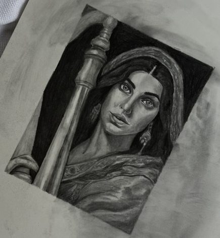
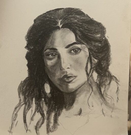
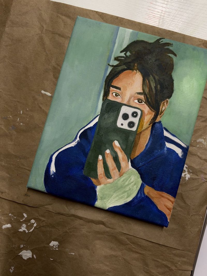
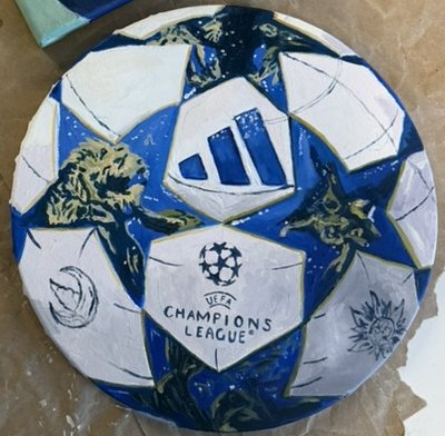
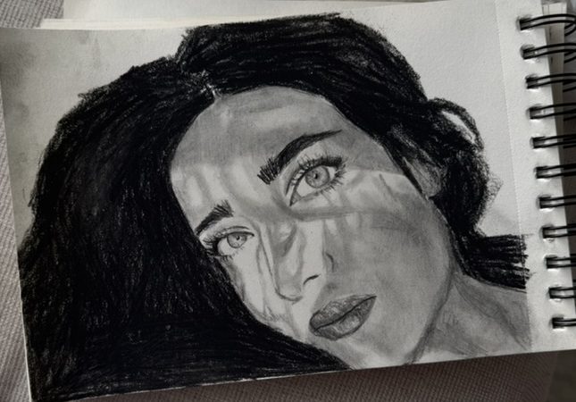
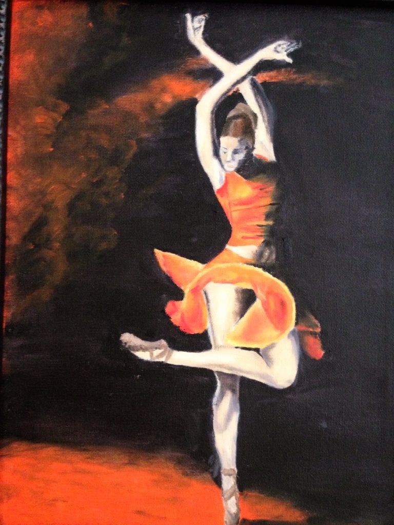
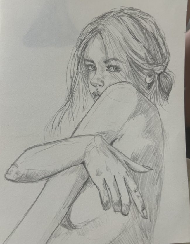
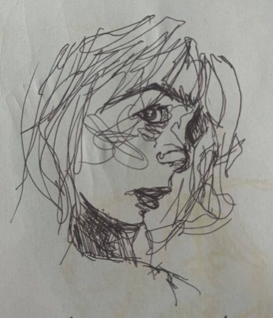
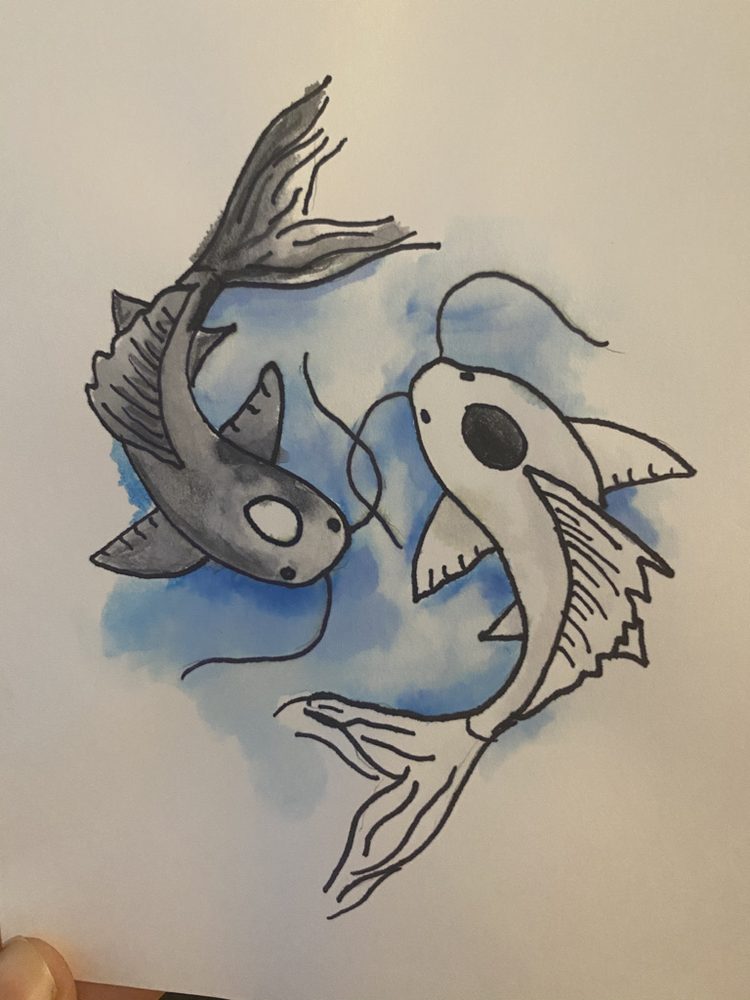
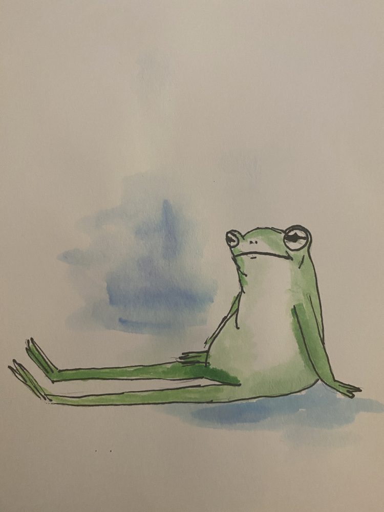
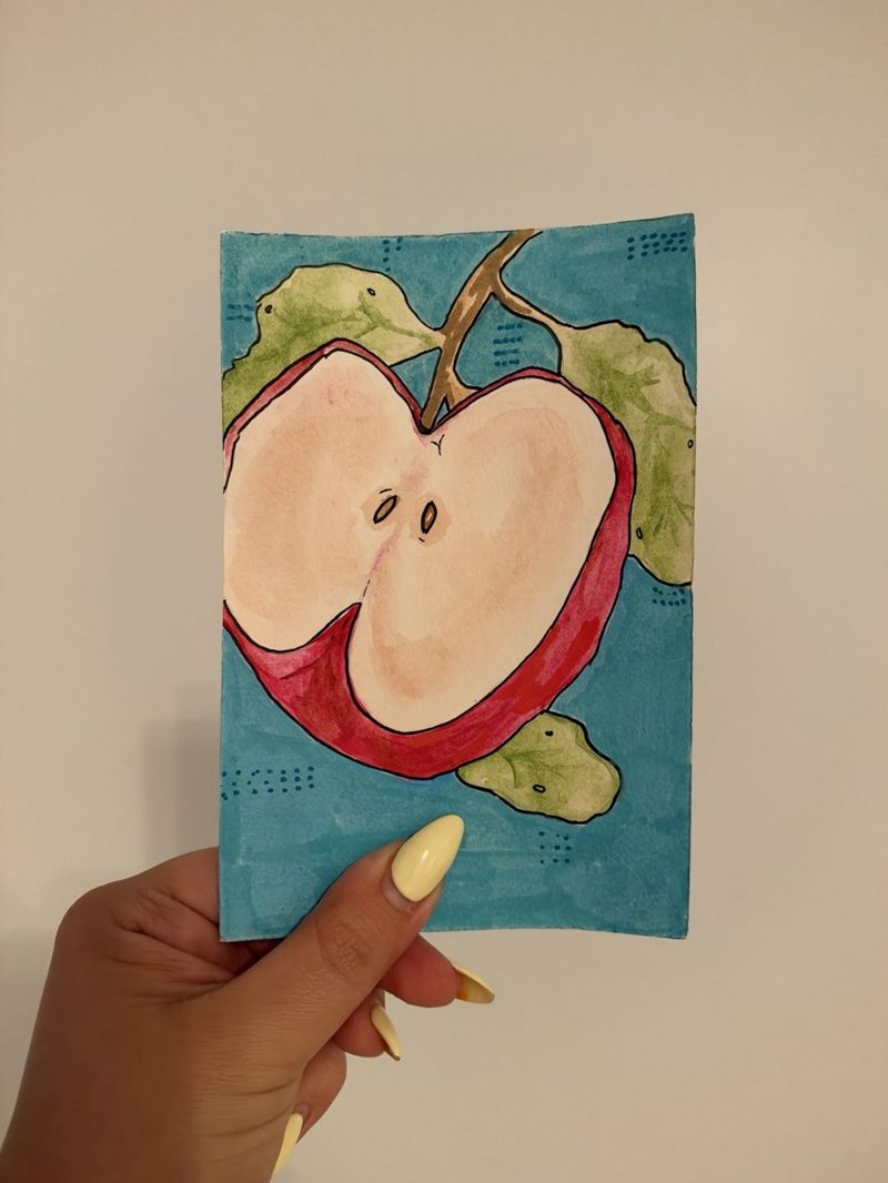
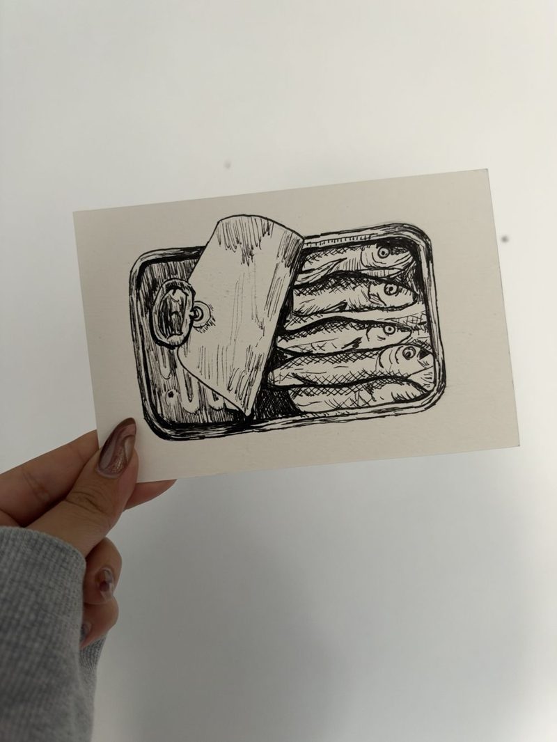
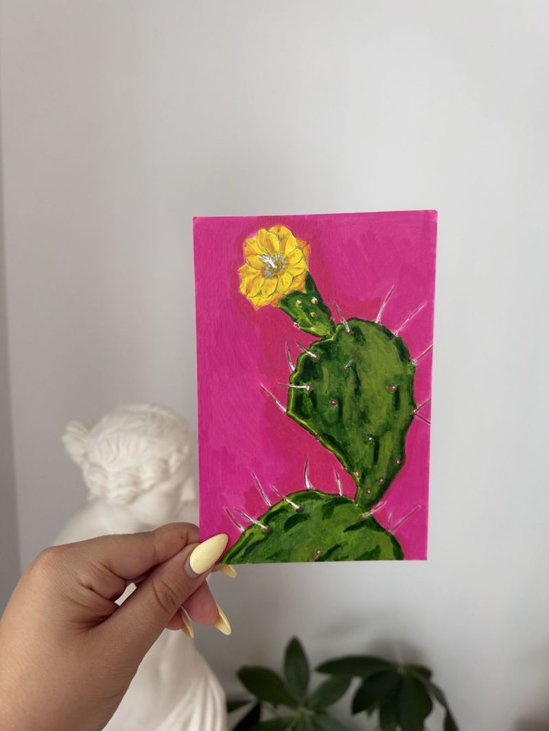
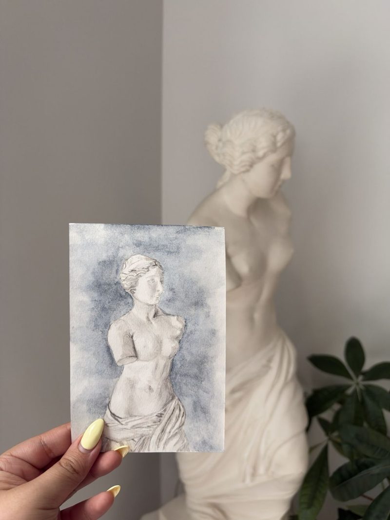
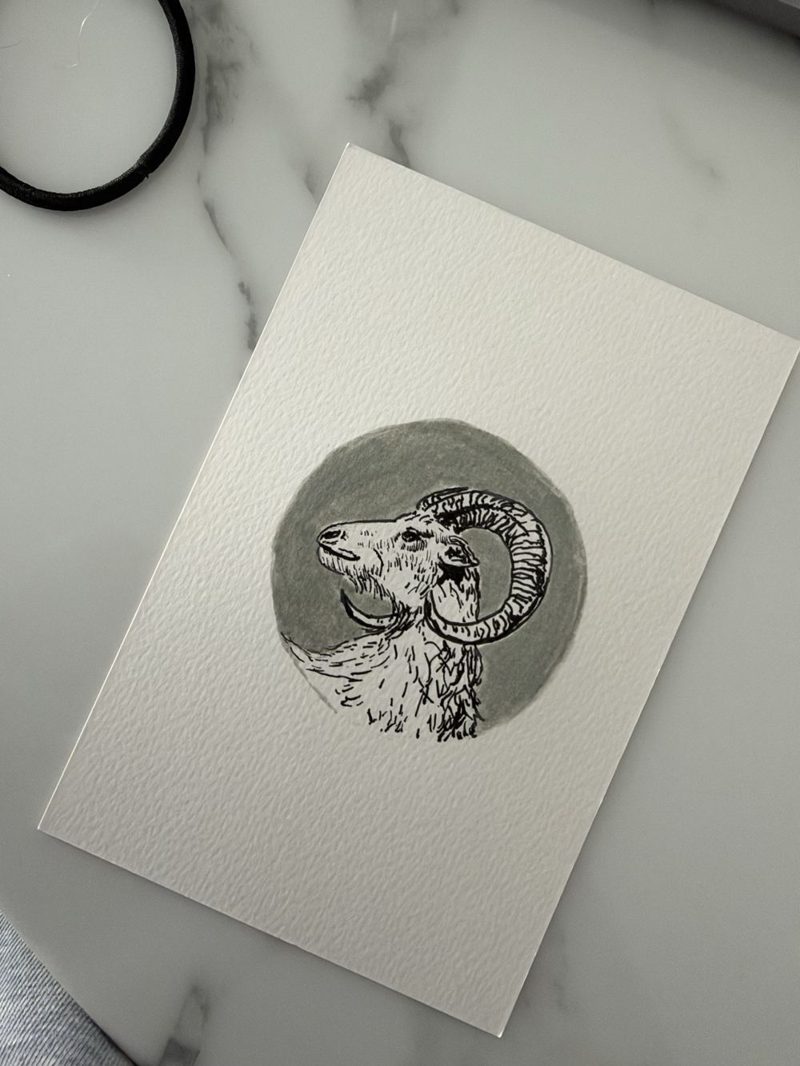
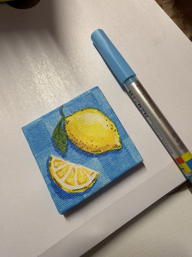
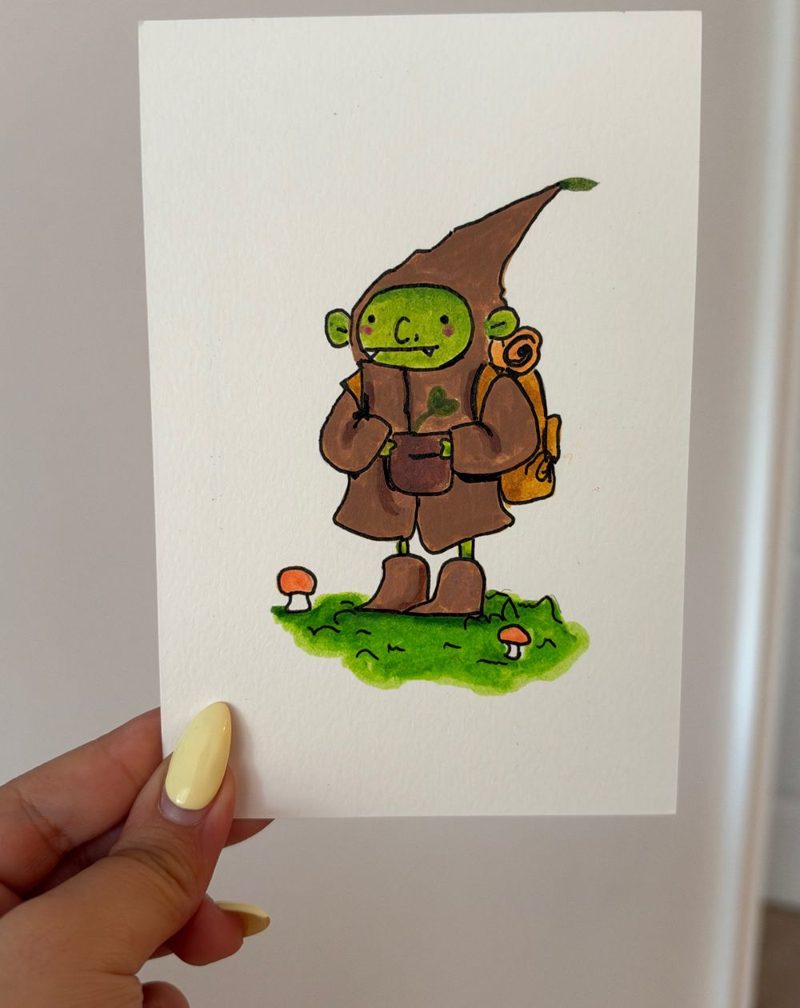
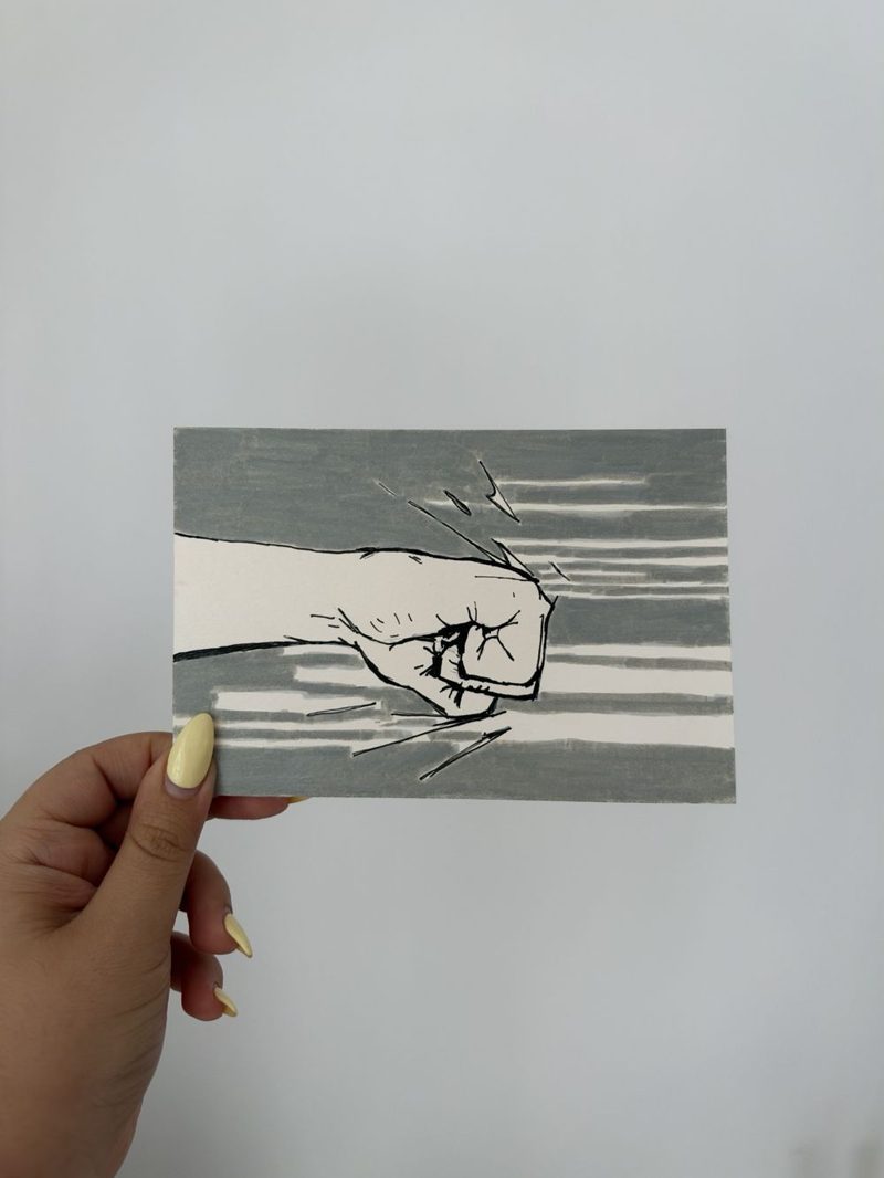
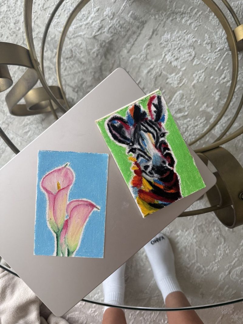
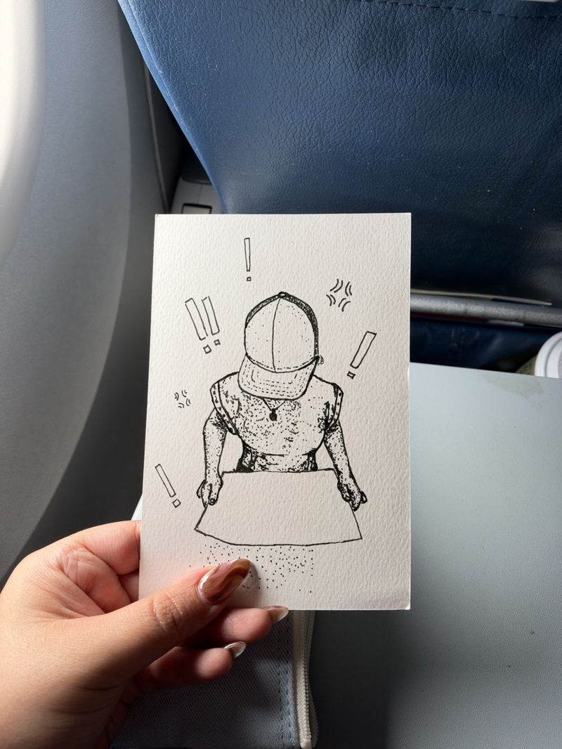
Posters, event branding, and the odd newsletter. Most of this is from college at Georgia Tech and my internship at Delta.
I was on the design team for Georgia Tech's hackathons. Our big event had 1,000+ people and more than 3,000 applicants a year.
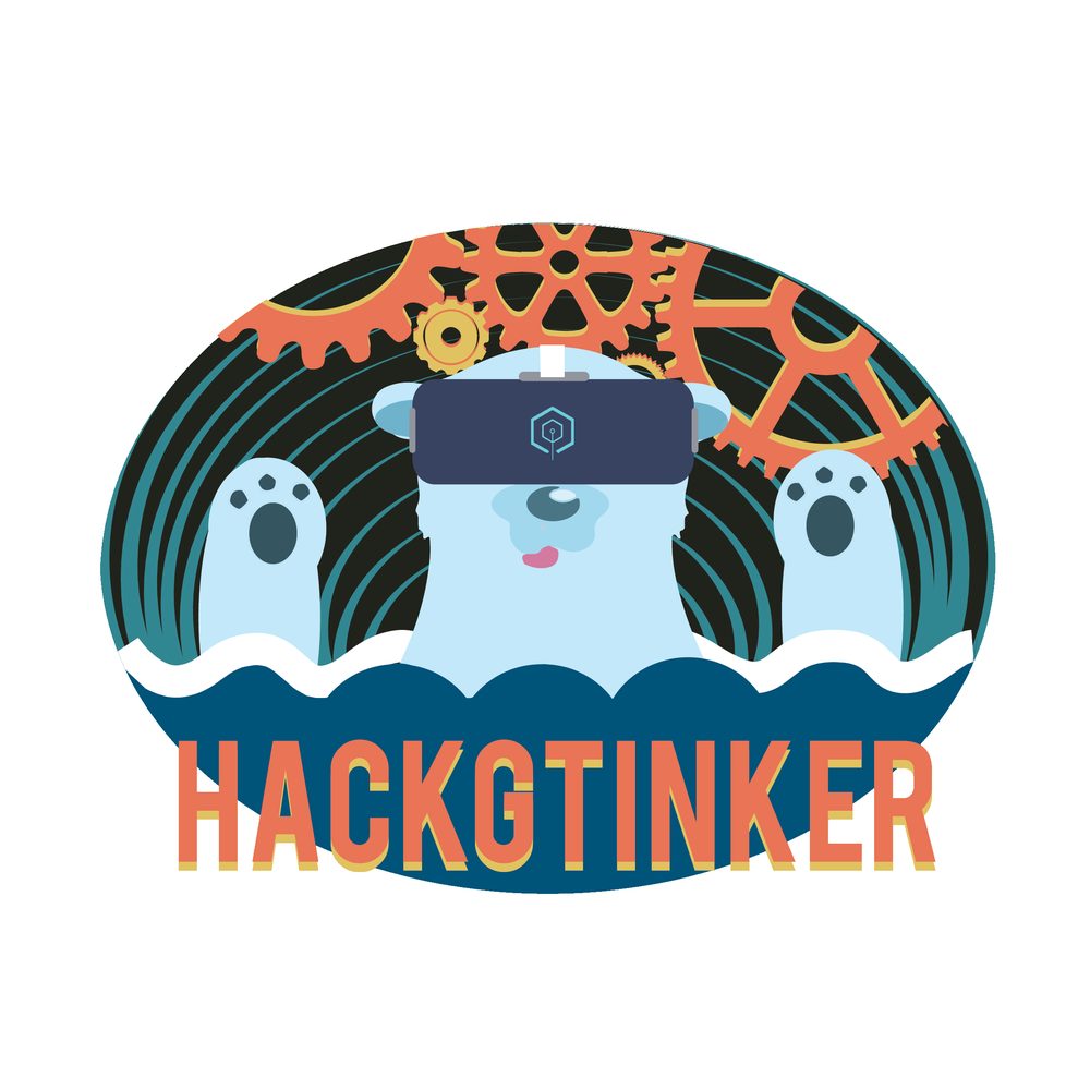
I did the whole identity for this one: the logo, the banner, and the badge everyone wore.
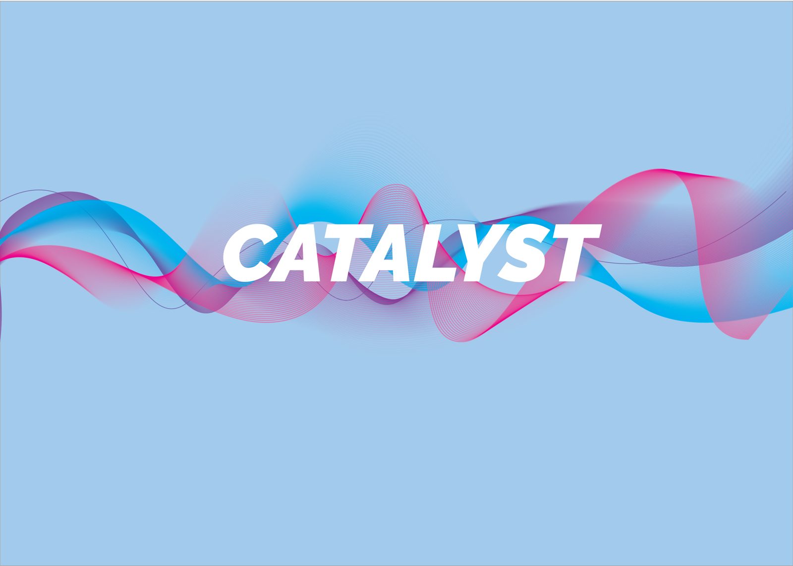
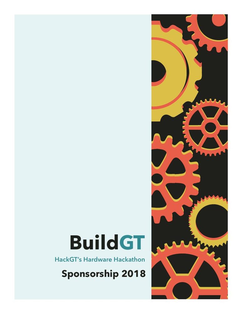
Our hardware events. I carried the gears from the sponsorship packet all the way to the mascot logo.
I made posters, screens, social posts, and shirts for campus events. They reached more than 20,000 students and staff.
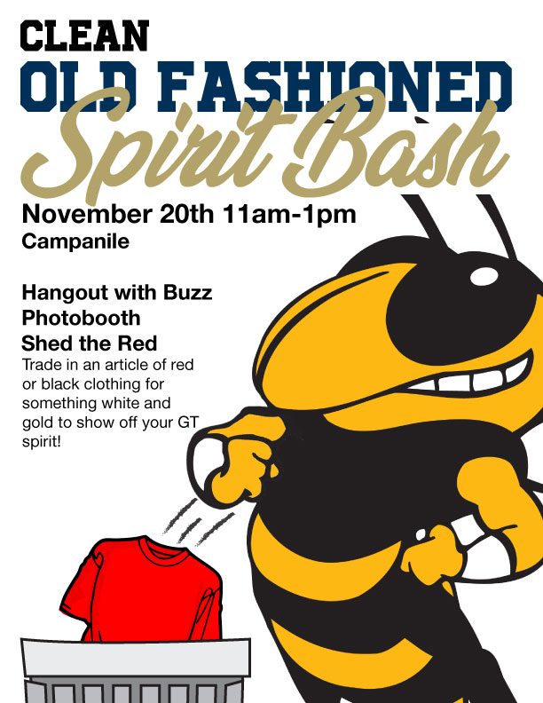
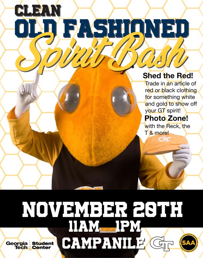
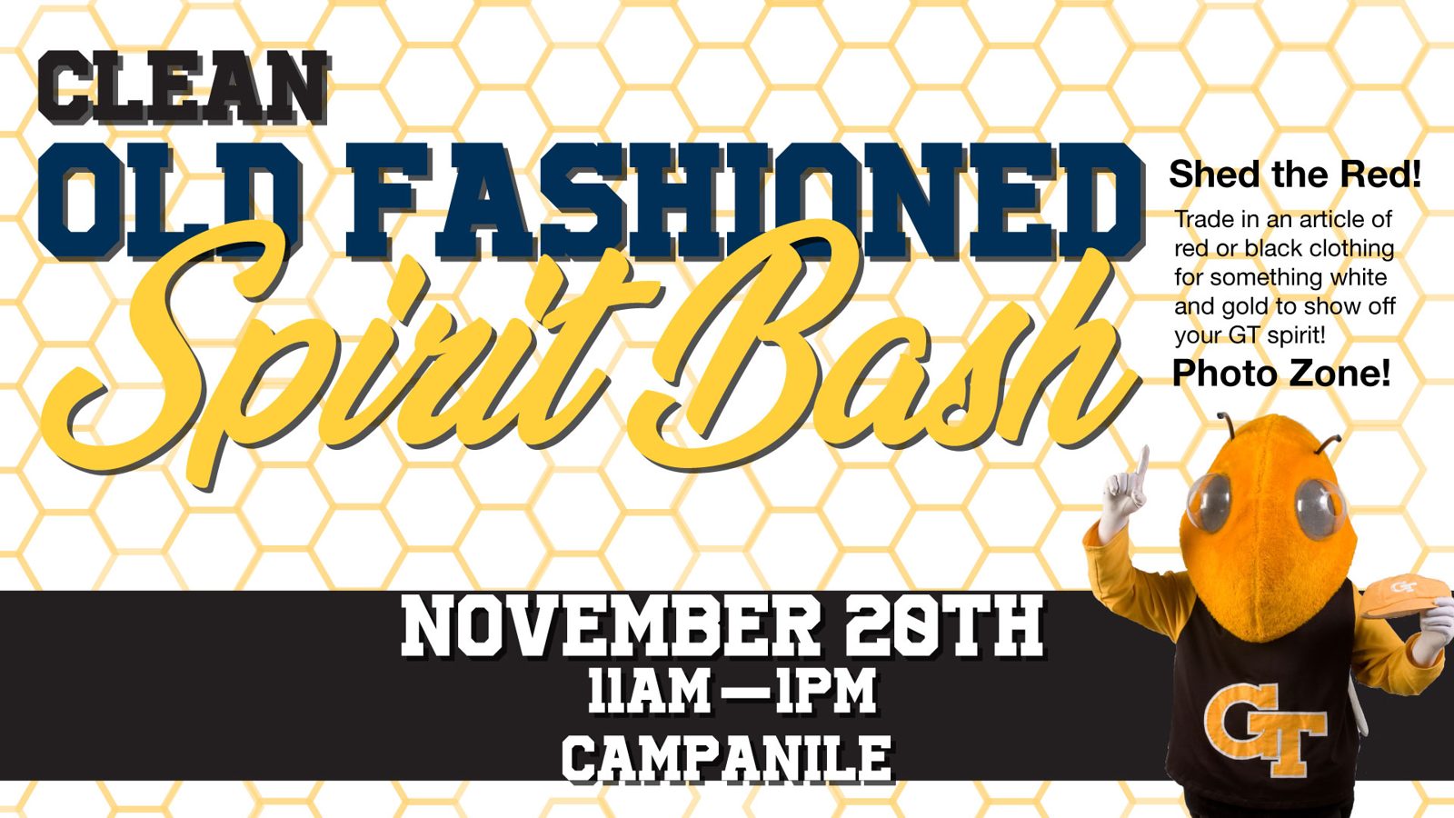
Same event, three ways: an illustrated poster, a photo version with Buzz, and a wide version for the screens around campus.
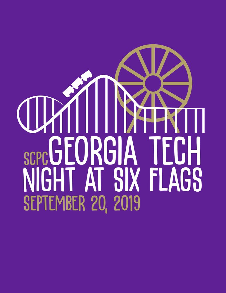
The screen graphic and the shirt both use the same coaster and Ferris wheel line art.

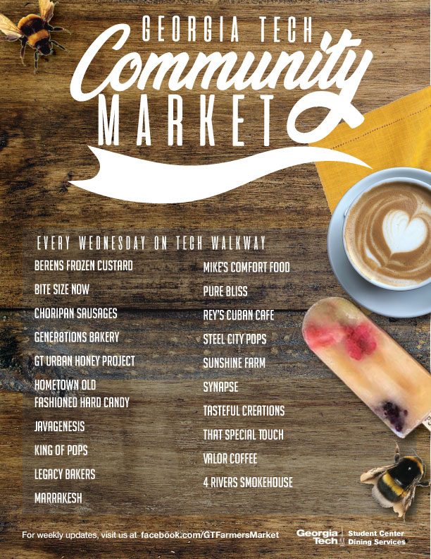
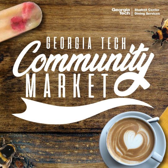
Branding for the weekly campus farmers market, with a vendor poster and a version for social.
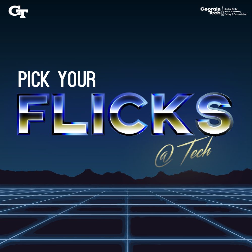
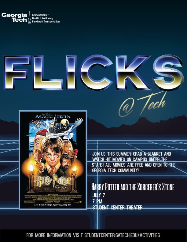
A summer movie series. I went full retro chrome and neon grid, then carried it into each screening.

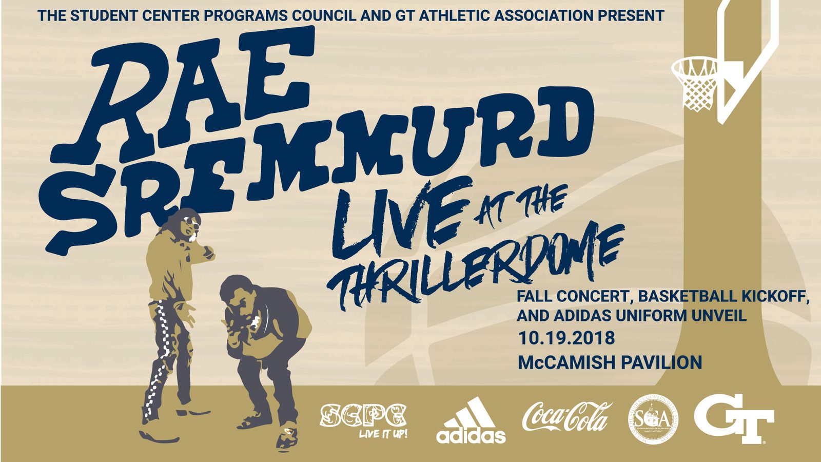
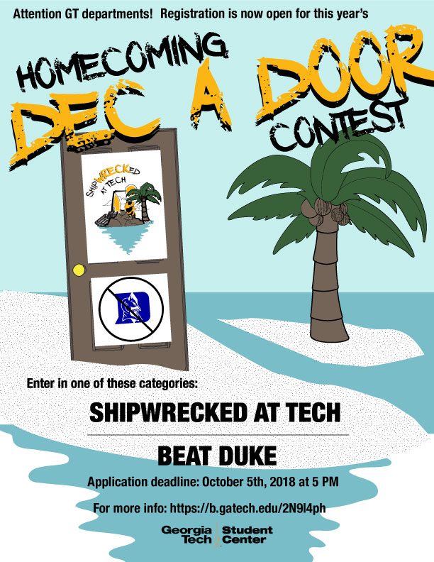
A concert, a homecoming contest, grad student events, and a values poster.
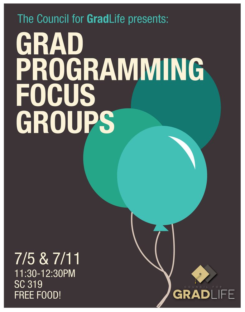
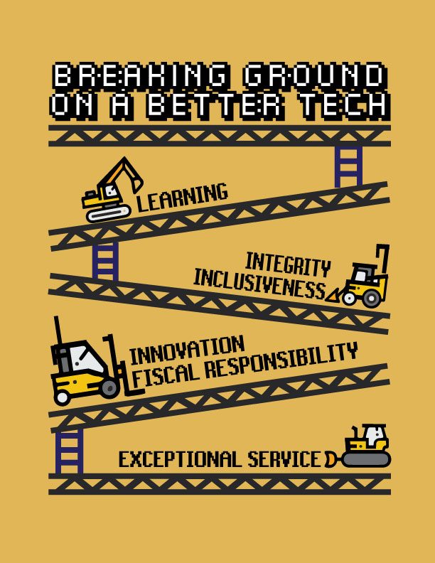
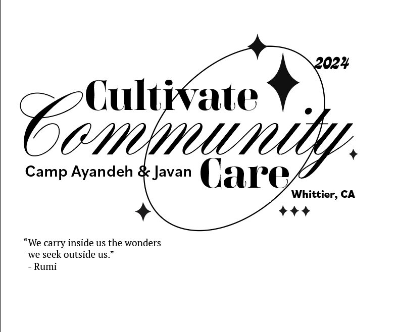
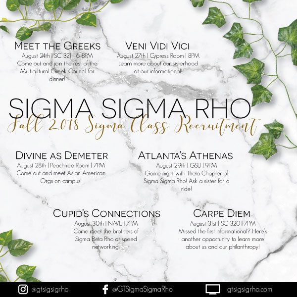
A weekly newsletter for Delta's IT team, a logo for Camp Ayandeh & Javan, and recruitment posts for my sorority.
Enhanced workflows is where HR admins build things like onboarding and leave of absence, and where employees go to get them done on web or mobile. I redesigned the whole thing so clients can set up workflows on their own, without calling us for help.
Simplified recreation. Admins build in steps and shape the employee's workspace with groups and order.
Building a workflow was hard enough that clients either called support or just didn't use it.
Two groups, and they want very different things. Admins build and keep an eye on workflows from the web. Employees and managers work through their tasks on web or mobile. Admins wanted more control. Everyone else wanted less to think about.
Our researcher and I ran 8 usability sessions on my coded prototype. Most were one person at a time, and one was a pair working through it together. Here's what stuck with us.
01 · Changed course
Our first plan was a guided "create your workflow" experience, and templates weren't even on the list. Research made it obvious people want to start from something that already works, so templates and duplicating became the main way in. The guided steps are still there if you want to start from scratch.
02
I split creating a workflow into steps (details, tasks, review) so admins can focus on one thing at a time and always know where they are.
03 · Reverted
When you create a task, there's a live preview next to the form, so you can see exactly how things like the employee's name will show up once it's sent. We cut it early on to simplify the screen. That was a mistake. People relied on it and liked having something familiar, so we brought it back.
04
Building and tracking used to be in two separate places. Now they're just two tabs on the same workflow. Admins track progress so they can send reminders and see who's behind, and now they can do that without leaving the workflow.
05
Whoever builds the workflow can group and reorder tasks to shape what employees see. Building happens on web, and employees can work through their tasks on web or mobile.
Simplified recreation. The preview we removed, then restored after testing.
We played with the idea of a task library, a place to grab tasks you've used before and drop them into any workflow. It's on hold because we don't have a repository built out to power it yet. For now, templates and duplicating cover a lot of the same need.
It was me, a PM, and a researcher. I built the test prototype with Claude in VS Code on our real components, so the 8 sessions felt like the actual product, and engineering had something working to reference. I've since shown other designers on the team how I did it.
The redesign covers about 10 client tickets, and clients can build workflows on their own now. It's rolling out in phases before general release, and so far the feedback has been that it's a lot better than before.
Want to see the real thing? The full version, with the actual designs and the coded prototype, is available on request. Email me at niaz.apour@gmail.com and I'll send it over.
Email me for accessMoving someone to another country used to mean firing them in one place and rehiring them in another. I designed a real transfer instead, so they stay one employee. It covers about 80 fields and a handful of people who each own a piece of it.
The five categories, validated with domain leaders.
A transfer is basically a job change, plus all the country-specific stuff the new location needs. Without a way to do that, companies were terminating people in one country and rehiring them in another, which splits one person's history into two records.
On top of that, some of the information doesn't even exist yet when the transfer starts. Things tied to the move, like a visa, only come in after the person relocates.
We started with a sticky-note session with my design, content, and product partners to get every field we could think of out on the table. I moved it all into Figma, sorted it out, and then checked it with the leads for each area, like compensation, benefits, and payroll.
We ended up with about 80 fields in 5 categories, with subsections where a category got big.
At first we looked at whether a transfer was just a termination plus a new hire, so we could combine those two flows. Once we laid them side by side, it was clear that wouldn't work. A new hire flow assumes you're starting from nothing, but someone transferring already has most of their info in the system. We would have been asking people to re-enter things we already knew.
01
Everything we already have is filled in and editable. The HR person just reviews it and changes what's different in the new country.
02
Work details has compensation, benefits, time, and payroll as subsections. Different specialists own each of those, so each one can be handed off separately.
03
The HR person can send a section to someone else. That person gets a notification and a task in their inbox, and takes over that part. Some pieces show up as a task to approve, and they can still edit if something's off.
04
If something's still pending, like a work permit, you can mark it "Applied for" and keep going. Once the employee starts in the new country, they get a reminder to fill it in.
Simplified recreation. Sections can be handed off, and missing details can be marked as applied for.
The design is done but it hasn't been built yet. Honestly, most of the work was the information architecture. Once the data had the right structure, the screens came together pretty naturally. Each person sees fewer fields, and nobody gets stuck on something they can't fill in yet.
Want to see the real thing? The full version, with the data map and the actual designs, is available on request. Email me at niaz.apour@gmail.com and I'll send it over.
Email me for accessWhen a company acquires another one, a single new hire upload can have thousands of people in it. I designed the new hire and job change uploads so HR teams can find and fix errors right in the app, lots of rows at a time, instead of fixing a spreadsheet and starting over.
Simplified recreation with sample data. Filter to errors, select rows, and replace one field's value for all of them.
Clients asked for this one. When an upload had errors, the app gave them almost nothing to work with.
We didn't have anything that could handle this much data, so we brought in AG Grid, a data grid built for really big tables. That opened up a lot. Now you can sort and filter thousands of rows, errors are highlighted on the exact cell, and you can edit any flagged cell right there.
01
Each error shows up on its cell with a hint on how to fix it. Most of them are a wrong format or invalid data, so the fix lives right on the field.
02
If a field has a set list of options, like legal entity, it's a dropdown of what's already in the system. That way you can't fix one mistake by making a new one.
03
In an acquisition, the same mistake can show up in hundreds of rows. You can select a bunch of rows and replace one field for all of them at once.
04
Big uploads show their progress as they go, so nobody's left wondering if a file with thousands of people in it is still working.
05
New hires and job changes work the same way. Job changes get used a lot for location and legal entity moves, like the example up top.
Bulk upload is a shared pattern across the product. My part was figuring out how it should work for new hire and job change uploads, and I worked with our pattern team on how to piece their existing patterns together for this flow.
We didn't do formal research on this one. Instead, we threw our most complicated flow at it, with the most data, the most fields, and the most errors, to see if it would hold up. We also made sure the grid stayed accessible and still felt easy to use inside the rest of the app.
Job change upload is live, and our sales team has told us it performs better than the old flow. We're still fine-tuning it to match our UX pattern, which has been tested on its own and performs very well. New hire upload is being built right now.
Want to see the real thing? The full version, with the actual designs, is available on request. Email me at niaz.apour@gmail.com and I'll send it over.
Email me for access